Website images
Responsive Images: Choose the Right Size for Phones and Desktops
Learn how to size images for phones and desktops, create useful exports, configure srcset and sizes, and test the files your website actually delivers.
Start with your website editor
In WordPress or a website builder, first check what the existing image block does. Your site may already create smaller versions from one upload.
- Upload a sharp source with enough detail for the largest view you need.
- Choose a suitable image resolution in the block, if that control is available. Making the block narrower does not necessarily change the downloaded file.
- Preview the page on a phone and a computer. Check the crop, small text and image sharpness.
Your website maintainer can verify that the page delivers suitable sizes. If you edit HTML yourself, the examples below show how to connect the files you export.
What are responsive images?
A responsive layout changes how a page fits the screen. Responsive image delivery changes which image file the browser requests. These are related but different jobs: making an image look smaller with CSS does not necessarily reduce the amount of image data downloaded.
If a 3000-pixel photo is displayed in a small card, the visitor may still download the full file unless you provide alternatives. Responsive images give the browser versions suited to the space available. They can improve efficiency while keeping important pictures clear.
There are two decisions to make. Resolution switching keeps the same composition and offers different pixel dimensions. Art direction changes the crop or composition when a wide image no longer works in a narrow layout. The MDN responsive images guide explains the distinction.
Screen width, display width and image pixels
The width that matters first is the image’s actual slot in the page, measured in CSS pixels. A phone viewport might be 390 pixels wide, but a page with 16-pixel margins on each side gives a full-width image 358 CSS pixels. On a desktop, an image inside a three-column grid may occupy only 320 CSS pixels.
A CSS pixel measures the image’s visible size in the page layout. On a high-density screen, one CSS pixel can use several physical screen pixels, so a sharper version may need more image pixels than its displayed width.
Pixel density is a second factor. As a planning estimate, multiply the slot width by the device pixel ratio. A 358 CSS-pixel slot on a 2× screen suggests about 716 image pixels across. This is a starting point for creating candidates, not a promise about the exact file every browser will request.
| Layout position | Display width | Approximate width at 2× density |
|---|---|---|
| Phone image with side margins | 358 CSS pixels | 716 image pixels |
| Desktop grid card | 320 CSS pixels | 640 image pixels |
| Article image | 800 CSS pixels | 1600 image pixels |
A desktop screen is therefore not automatically a reason to serve the largest file. Conversely, serving a very small image to every phone can make pictures look soft on high-density displays. Inspect the actual slot and the visible result.
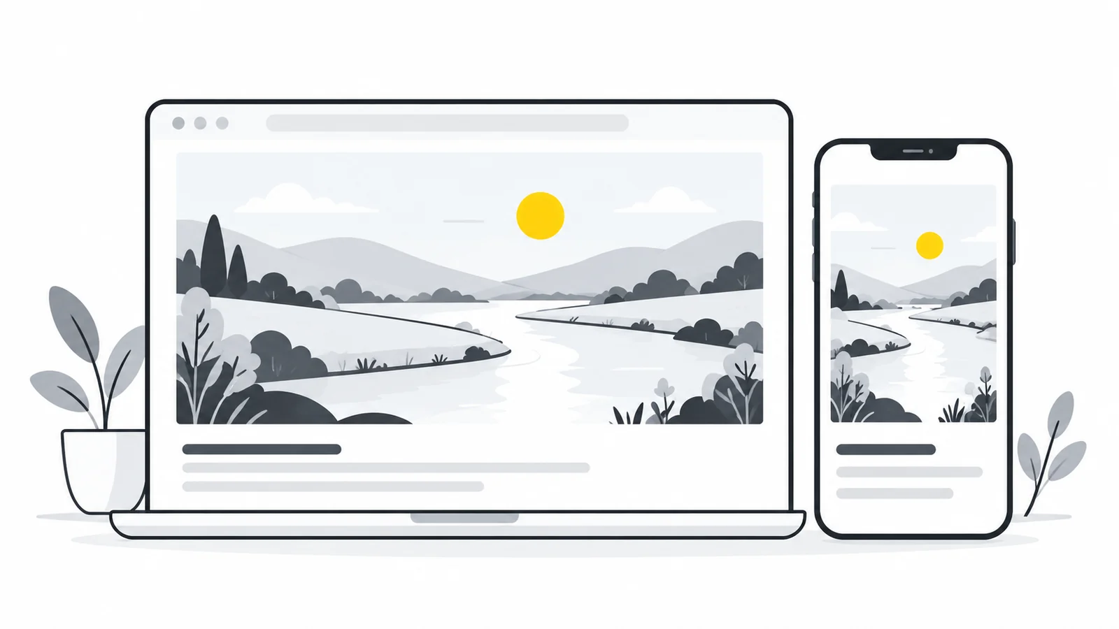
How to create useful image sizes
- Find the largest intended display width. Check the page’s content column or card rather than the whole screen.
- Choose a representative set of widths. For an article image capped at 800 CSS pixels, candidates such as 400, 800, 1200 and 1600 pixels are a reasonable first test. They are an example, not a required universal set.
- Export each candidate from the same original. Use Pixilo’s image resizer and keep the same aspect ratio for resolution switching. Keep the original separately.
- Compare format and quality. Test WebP or JPG → AVIF / PNG → AVIF / WebP → AVIF where your publishing setup supports them. Make sure an apparent size saving is not caused by unreadable text or missing detail.
- Upload the files and connect them to the page. Resizing in Pixilo creates image files; it does not configure your website’s HTML, CMS or CDN.
- Check delivery on the published page. Verify the requested file, its dimensions and its appearance at several viewport widths.
Do not enlarge a small original simply to reach a target number. Upscaling does not recover real detail. If the source is too small for a large display, use a smaller presentation or obtain a better original. See how to resize without stretching for preserving proportions.
What to check in WordPress or another CMS
Your publishing system may already generate several image sizes and add responsive markup. Inspect the final page before creating a parallel manual setup. Check whether the generated sizes fit your theme’s actual slots and whether the selected format is supported throughout the image pipeline.
An image plugin or CDN may transform files on request. In that case, verify what the browser receives rather than relying on the original upload’s filename. Replacing a source can also leave cached versions in circulation. Confirm the new image is being served before judging the result.
For WordPress-specific steps, read how to optimize WordPress images. The goal is a predictable delivery setup, with each component doing a clear job.
Optional: use srcset and sizes in HTML
The following example describes an article image that fills the viewport minus 32 pixels of combined side margins, until it reaches a maximum width of 800 CSS pixels. The filenames are examples: upload your own exports and use their actual paths and dimensions.
<img
  src="/images/coast-800.webp"
  srcset="/images/coast-400.webp 400w,
          /images/coast-800.webp 800w,
          /images/coast-1200.webp 1200w,
          /images/coast-1600.webp 1600w"
  sizes="(max-width: 832px) calc(100vw - 32px), 800px"
  width="1600" height="1067"
  alt="Rocky coastline beside a calm blue sea">
The w descriptors must match each file’s real pixel width. The sizes value describes the expected display width, which helps the browser select a candidate. It does not set the visual width of the image; your CSS still needs to match the layout described.
For this example, a container capped at 800 pixels and an image styled with display: block; width: 100%; height: auto; would provide the intended scaling. Do not copy the example’s sizes value into a card grid with a different layout. Describing a small desktop card as 100vw can encourage an unnecessarily large download.
Browser selection can take density and other conditions into account, so expect a suitable candidate rather than one guaranteed filename. Keep width descriptors and density descriptors such as 2x out of the same candidate list. See MDN’s srcset reference for descriptor rules.
When a phone needs a different crop
A wide banner may become too short on a phone, leaving its subject tiny even if the image is sharp. More pixels do not fix that composition. Create a tighter crop that keeps the subject visible and use picture with a media condition to select it.
Use Crop image to prepare the alternative deliberately. Keep enough context to make the picture understandable. Check where any text overlay will sit; a crop that looks attractive by itself may place the subject underneath a button or heading.
Art direction adds maintenance work because you have distinct compositions to check. Use it when the narrow layout needs it, rather than creating a separate phone crop for every image. If crops have different aspect ratios, account for that in the layout so the correct space is reserved at each breakpoint. The picture element reference explains source selection.
Dimensions, lazy loading and the main page image
Supply accurate width and height attributes to give the browser an aspect ratio before the file arrives. With proportional CSS sizing, this helps reserve space. If CSS fixes both dimensions or applies a different crop, check that the reserved area still matches the final presentation.
Images well below the initial viewport are candidates for loading="lazy". An important image visible as soon as the page opens should normally load without lazy loading. Delaying the main image can hurt the experience even if its file is small. See web.dev’s browser image loading guidance.
If measurements identify a particular image as the Largest Contentful Paint element, consider whether fetchpriority="high" is appropriate for that image. Do not give every picture high priority. Responsive sizing is one part of a loading strategy; it does not fix a slow server response or a page that discovers its main image late.
How to test whether your responsive images work
- Open the published page at a narrow phone width, a tablet width and a desktop width.
- Inspect the image’s display width and the URL selected by the browser. The image element’s
currentSrcproperty identifies the selected resource. - Check the network request to confirm the file’s transfer size. Disable caching for a fresh test where necessary.
- Compare the picture at normal viewing size, including text, edges and the intended crop.
- Test a fresh load at each size. Resizing an already loaded page does not reliably simulate the image choice on a new visit.
- Measure the page’s loading behavior before and after the change under comparable conditions.
If a phone still requests a huge file, check that srcset is present on the rendered page, descriptors match real widths and sizes reflects the actual slot. If the image looks soft, check the source dimensions before increasing compression quality. If it stretches, correct the aspect ratio rather than adding another larger file.
Responsive images and SEO
Responsive delivery helps you avoid making visitors download image data they do not need. It does not create a ranking guarantee. Keep the image relevant to the page, provide useful alternative text and retain an img with a valid src when using picture. Google’s image SEO documentation covers image discovery and responsive markup.
For the relationship between image loading, layout shifts and page experience, see images and Core Web Vitals. Measure the real page, rather than treating a smaller export as proof that every performance metric improved.
Frequently asked questions
Is width: 100% enough to make an image responsive?
It can make the image fit its container visually. It does not create smaller downloadable versions. Use appropriate source files and responsive markup for that separate task.
Do I need a different image for every phone?
No. Offer a manageable set of sizes suited to your layout. The browser chooses among them; you do not need to identify every device model.
Should every image be twice its displayed width?
No. A 2× version is a useful candidate for some displays, not a universal requirement. Balance visible sharpness with file size and keep smaller versions available.
Can Pixilo add srcset to my website?
Pixilo can help create resized image files. Your website, template, CMS or image service must publish those files and configure the responsive markup.
Create the sizes your layout actually needs
Export suitable widths from the same original, connect them through your CMS or accurate srcset and sizes, then check the requested file on a fresh mobile and desktop visit. Smaller files help only when the page actually uses them.
Resize an imagePrepare an alternative crop → ChatGPT
 Grok
 Google
 Perplexity
 Claude