Publishing workflows
How to Optimize Shopify Images: Sizes, Formats and Compression
Prepare Shopify product photos with suitable dimensions, clear crops and sensible compression. Check automatic image delivery, mobile layouts and image SEO.
Example: prepare a main product photo
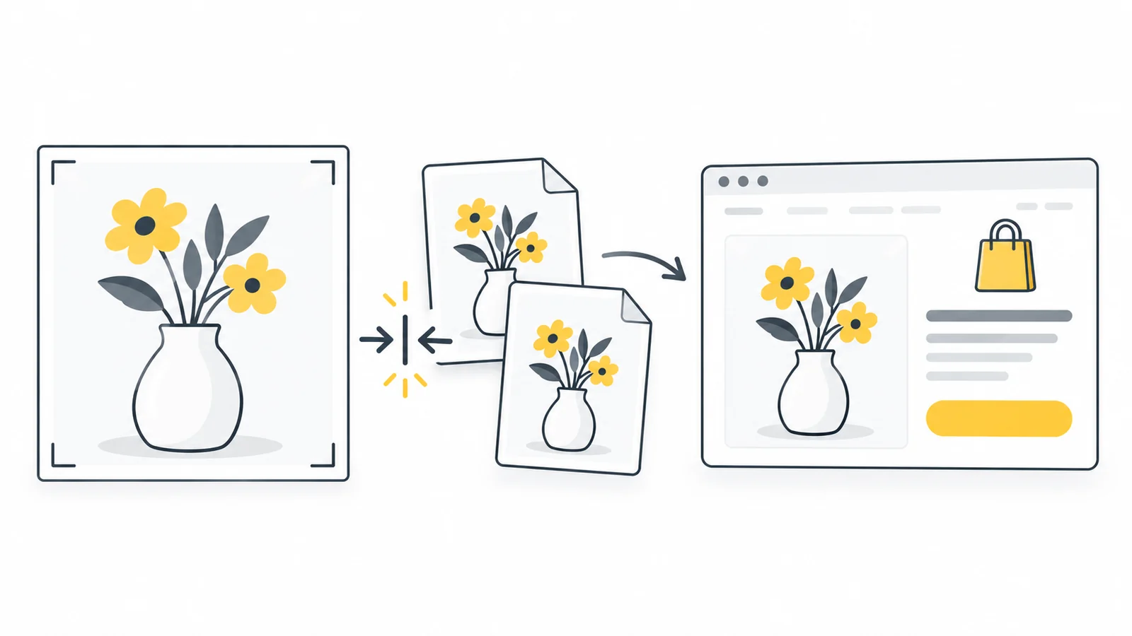
Imagine you have a clear 3600 × 2400 product photo and your store uses square main images.
- Choose the crop. Try a 2400 × 2400 square that keeps the whole product visible. If the product does not fit, use a different composition rather than cutting off an important part.
- Check consistency. Compare it with two existing product cards. Adjust the surrounding space so the product appears at a comparable scale.
- Prepare a suitable source. Compare a 2048 × 2048 copy with the crop at full size. Keep enough detail for the theme's product view and zoom. Do not enlarge a smaller source just to match this number.
- Choose the format. Use a clear JPG for a photo on a solid background, or PNG if transparency is necessary. If testing compression, make the candidate from the clean source.
- Upload and inspect. Check the product page, collection page and phone layout. Confirm that no important edges are cut off and that zoom reveals useful detail.
- Check delivery. If the page is blurry or slow, investigate the image version the theme loads before making another export.
Once this works for a small sample, apply the same preparation to similar products. Review exceptions individually. Reflective jewelry and a plain cardboard box may need different compression settings even when the composition and dimensions match.
Understand what Shopify already does
There are two different files to think about: the image you upload and the version a customer downloads when they visit your store. Reducing the upload from 4 MB to 1 MB does not necessarily reduce the customer's download by the same amount.
Shopify creates different image sizes and can deliver modern formats such as WebP or AVIF when supported by the customer's browser. Its theme image guidance says manual compression before upload is not required. The original upload is kept at its original quality in the admin, while the storefront can receive an optimized version.
This makes a clear, well-composed source more useful than a file made as small as possible at any cost. If you heavily compress a photo before uploading it, Shopify cannot restore the detail you removed. If you upload a clear image but your theme requests a tiny version and stretches it, the source is not the problem.
Start with the problem you can see. If a product is cropped awkwardly, fix its composition or the theme's crop setting. If the original is blurry, use a better photo. If a clear image loads slowly, investigate the version sent to the customer. Compressing the original again is not the right first step for all three problems.
Choose dimensions for the placement
Choose dimensions for the largest useful view of the image, not just the small collection card. A photo that looks sharp in a thumbnail may be too small for the product gallery or zoom. Pixel dimensions describe width and height; file size in KB or MB describes how much data the file contains.
For product and collection images, Shopify allows up to 5000 × 5000 pixels, or 25 million pixels, with a file size smaller than 20 MB. It suggests 2048 × 2048 pixels as a useful size for square product photos. That is a starting point, not a requirement for every store. Check the product media requirements before preparing a large batch.
Upload limits can differ by location. Shopify's Files documentation lists a 20 MB limit and 25 million pixels for images, while its theme image guidance lists 20 million pixels for other image uploads. Use the guidance and any error message for the field you are uploading to, rather than treating one limit as a rule for the whole admin.
| Placement | Starting point | What to check |
|---|---|---|
| Square product gallery | Try 2048 × 2048 pixels from a sharp source | Can customers read labels and see materials in the gallery and zoom? |
| Collection product cards | Use consistently shaped main photos; let the theme request smaller versions | Are product scale and margins similar across a row? |
| Banner shown at 1200 × 600 pixels | Compare a 2400 × 1200 source; use the theme's recommended shape | Does the subject stay visible in the phone layout? |
| Article image shown at 800 pixels wide | Compare 800- and 1600-pixel-wide sources | Does the larger version make a useful difference to detail or readability? |
For example, a product photo displayed at 700 pixels wide may benefit from a 1400-pixel-wide version on a screen that uses two image pixels for each display pixel. This is a planning example, not a rule to double every upload. Zoom may require more detail, and the theme should still choose a smaller version for a small card.
Do not make every source square just because square product cards are common. A tall bottle, a clothing photo and a landscape photograph may need different compositions. Keep the shape consistent within a group where consistency helps customers compare products.
A banner displayed at 1200 × 600 pixels has a 2:1 shape. A 2400 × 1200 source has the same shape and offers more detail for high-density screens. These are example dimensions, not Shopify banner requirements. If the mobile section is tall and narrow, that same image may lose most of its sides. A separate mobile image can help if your theme supports one.
Choose JPG or PNG for the content
Start with JPG for an ordinary photograph without transparency. Start with PNG when you need a transparent background or when a graphic contains sharp lettering and fine lines that look worse in JPG. Compare the files rather than assuming the same format suits the entire catalog.
A PNG photo can be much larger than a JPG photo, but converting it is only useful if the result still shows the product accurately. Look closely at fabric, jewelry, wood grain and small printed labels. A smaller file that hides those details is not a good product image.
Uploading WebP is an option, not a prerequisite for modern delivery. Shopify can select a delivery format independently of your upload format. Likewise, seeing AVIF delivered to a browser does not mean you must upload AVIF files. Check which source formats the particular upload field accepts.
A white background is not transparency: if the photo already has a white rectangle behind the product, saving it as PNG will not remove that rectangle. Check a transparent image against the actual page background, including around pale edges and shadows. Our image format guide explains when the different formats are useful.
Make product photos consistent without cutting off details
Aspect ratio means the relationship between width and height. A 2000 × 2000 photo and a 1000 × 1000 photo have the same square shape, even though they contain different amounts of detail. Consistent shape alone is not enough: products should also occupy a similar amount of space in each main photo.
Compare a row of collection cards. If one shoe fills the frame and another is surrounded by a large white margin, the row can look uneven despite identical dimensions. Adjust the composition so customers can compare the products easily. Leave enough room around each product to keep its edges visible.
Cropping removes part of the picture. Resizing changes its dimensions. Stretching changes its proportions. Use the image cropper to choose the composition and the image resizer to reduce dimensions while preserving proportions. Stretching a bottle to fit a square gives customers an inaccurate view of its shape.
To prepare a set together, use the Product Image Optimizer: choose a shared canvas and margins, crop or position each photo, then compare the set in All images. Check that similar products occupy a consistent amount of the frame; a common canvas cannot correct different source framing automatically. Export a clear JPG, or PNG when you need transparency, and inspect it in your theme. The tool prepares files; Shopify still controls delivery and your theme’s display settings.
Shopify's theme image settings can use a focal point to keep an important area visible when an image is cropped, depending on the theme. This helps a banner keep a face or product in view, but cannot guarantee that every part of a wide composition fits a narrow screen. Check the preview on both screen sizes.
Keep promotional headings and buttons in the theme's text fields where possible. Text baked into a banner may become too small on a phone or be cropped off. Real page text can wrap, remain selectable and provide a working button rather than a picture of one.
Decide whether compression before upload helps
Compression can be useful when a source is unnecessarily large, uploads slowly or exceeds an upload limit. It is less useful when the source is already clear and manageable and Shopify is delivering a suitably sized image. Do not reduce quality just to reach an arbitrary target such as 100 KB for every product photo.
Keep an untouched copy. If dimensions are excessive for the intended use, first resize a copy to a suitable size. Then compare compression at that size. Resizing a photo intended for a small content block can save more than repeatedly compressing a huge source, but a product zoom view may justify keeping more detail.
To compare a compressed copy, use Pixilo's image compressor. It accepts up to 20 JPG, PNG or WebP images at once, with a maximum of 25 MB per file, and keeps their format and dimensions. Its input limits are separate from Shopify's. Start with a few representative images so you can inspect them before processing the rest.
PNG compression in this tool is lossless: it keeps the pixels unchanged. An already well-compressed PNG may only become a little smaller. JPG and WebP compression can change fine detail, so inspect the downloaded copy. If compression does not produce a smaller file, Pixilo keeps the original.
For product photos, compare at the size customers will see and in any zoom view they will use. Check fine textures, small labels, smooth backgrounds and edges around transparent objects. Return to the original if the result loses useful detail. Our product image optimization guide covers these quality checks in more detail.
Write helpful alt text and clear filenames
Image SEO starts with an image that helps someone understand the product. Give it a useful filename before uploading, such as olive-canvas-backpack-front.jpg. Avoid a filename made from a long list of search terms. The name should distinguish this image from the side view or detail shot.
Alt text is the written alternative for an image. For a meaningful product photo, describe the relevant view: “Olive canvas backpack, front view with two outer pockets.” For a detail photo, explain the detail instead of repeating the main image's description. Do not add a price, discount or keyword that the image does not help explain.
Google's image SEO guidance recommends descriptive filenames and useful alt text without keyword stuffing. The surrounding page content also helps provide context. A filename is a small clue, not a substitute for a useful product page.
Add alt text to a Shopify product image
- In the Shopify admin, open Products and select the product.
- Click the image in its media section to open the preview.
- Select Add alt text, enter a brief description and select Save alt text.
- Repeat for the other useful views, describing what each one shows.
These steps follow Shopify's product media alt text instructions. Theme banners have their own image controls. If an editor suggests a description, check it against the photo before accepting it: color, material and product details should be accurate.
Do not assume that a description in your computer's file properties becomes alt text automatically. A theme may use an image differently across sections. Decorative images may need an empty text alternative, while a linked image needs to make its destination understandable.
Our alt text and filename guide explains these cases with examples. Image descriptions support accessibility and understanding; they do not guarantee search rankings or compensate for missing product information.
Check the published store on mobile and desktop
Previewing the source in the admin is not enough. Start with these checks on the published store; they do not require developer tools.
- Open a product on your phone. Can you see the full product, read important labels and distinguish its material?
- Check a collection row. Do the main photos have consistent shapes and margins?
- Try the gallery and zoom. Do additional photos add useful detail? Does the selected color or variant show the right product?
- Reload the page. Does the main photo appear promptly, and do text and buttons stay in place while images load?
- Repeat on a larger screen. Check wide banners and any larger product view rather than relying only on a narrow preview.
If you need to investigate a blurry or slow image
If an image is persistently blurry, check whether the theme is stretching a small version. If the page downloads a huge image for a small card, check whether the theme provides appropriate smaller versions. Responsive images let the browser choose between sizes for different layouts and screens.
Shopify's image_tag documentation explains how theme code can provide image size choices. If a theme needs a correction, ask its developer to check the requested dimensions and the srcset and sizes attributes. You do not need to manually upload every thumbnail size to solve a theme code problem.
If you are comfortable using browser developer tools, the Network panel can show what the page actually downloads. You can also send the affected page and image to your theme developer.
- Open the product page, open developer tools and select Network.
- With the panel open, disable the browser cache for the test and reload the page. This helps you inspect a fresh download rather than a saved copy.
- Filter for images and find the main product photo. Check the request preview so you do not mistake a small gallery thumbnail for the main image.
- Inspect the transferred size, image dimensions and the Content-Type response header. A URL ending in .jpg can still deliver WebP or AVIF.
- Repeat at the phone layout width after reloading. Check that the smaller layout is not unnecessarily downloading the largest available version.
Do not judge delivery by file size alone. A larger version may be justified on a high-resolution screen or for zoom. Look for clear mismatches, such as a tiny image stretched across the gallery or a full-resolution source downloaded for every small collection card.
The main image near the top should be available promptly. Images farther down can usually wait until the visitor approaches them. Shopify's developer guidance advises against lazy-loading images above the fold, meaning those visible without scrolling. Ask the theme developer to check loading behavior if the first product photo appears noticeably late; making every gallery image load immediately can create a different problem.
Check loading speed and movement separately
When the main product photo is the largest visible element, it can affect Largest Contentful Paint (LCP), which measures when the largest visible image or text block appears. A smaller download helps only if downloading the image is part of the delay. A request that starts too late can remain slow even after compression. Google's LCP guidance explains the distinction.
If a photo pushes the price or purchase button down as it appears, the theme may not have reserved enough space for it. This contributes to Cumulative Layout Shift (CLS), a measure of unexpected page movement. The solution is to reserve the image's space in the layout, not simply to compress it more. See Google's layout shift guidance and our guide to images and Core Web Vitals.
Compare the same page before and after a change, using similar conditions and changing one thing at a time. Separate PageSpeed's simulated test from any real visitor data it shows. Scores can vary, and real visitor data does not update immediately after an edit. Record the issue you fixed rather than relying on one higher score.
Troubleshoot the problem before changing every image
| Problem | Check first | Useful next step |
|---|---|---|
| The product is blurry | Whether the original is clear and the displayed version has enough pixels | Improve the source or correct the theme's requested size; more compression will not fix blur |
| The product is cut off | The section's aspect ratio, crop settings and mobile layout | Adjust the composition or focal point and check both layouts |
| An upload fails despite a small file size | Pixel dimensions, accepted format and the specific upload field's limits | Resize a copy or use a supported format instead of repeatedly compressing it |
| Collection cards look uneven | Main photo shapes and the amount of space around each product | Standardize composition and check the theme's card settings |
| The first photo loads late | Loading behavior, requested image size and other page requests | Check the theme before reducing source quality again |
| Smaller uploads barely improve speed | The actual downloaded image and the page's other work | Investigate scripts, apps and theme behavior if image delivery is already appropriate |
Shopify's store performance guidance identifies themes, apps and added code as other factors. Its performance reports use real visitor data. If images are already delivered efficiently, focus on the remaining bottleneck instead of adding another image app or compressing the catalog more aggressively.
Which images should you fix first?
Start with the main photo and collection card for a frequently visited product, then a prominent homepage banner. Prioritize a visible problem: an unclear label, a cut-off product or an image that appears late. A lightly visited gallery's fifth photo is usually a lower priority than the main image customers see before deciding whether to keep browsing.
Record the page, source dimensions, crop and format, plus what improved after the change. Keep the original so you can undo a poor result. Apply a successful workflow to similar products, then check exceptions individually instead of replacing the entire catalog in one pass.
Frequently asked questions
What is the best image size for Shopify product photos?
There is no single best size for every layout. A 2048 × 2048 image is a useful starting point for square product photos, but the theme, composition and zoom feature determine what you need. Use a clear source within the upload limits and check the published product page. Do not enlarge a small photo just to reach 2048 pixels.
Does Shopify compress images automatically?
Shopify optimizes image delivery and can send different sizes and formats to customers. That does not mean the original stored in the admin is replaced by a heavily compressed copy. You can still improve a poor crop or oversized dimensions before upload, but manual compression is not required for every image.
Should all Shopify product images be below 200 KB?
No. An arbitrary file-size target can remove useful detail, especially from zoomable product photos. Check the size and quality of the version actually downloaded by the customer. A small collection thumbnail and a large product detail image have different needs.
Is PNG or JPG better for Shopify?
Try JPG for photographs without transparency and PNG for transparent graphics or sharp text that does not look clear in JPG. Check the actual result, particularly fine product details. Shopify's delivery system may use a different format from the one you upload.
Do I need an image optimization app?
Not just to get Shopify's automatic image delivery. An app may be useful for a specific task, such as managing a large image library, but first identify what the built-in tools and your theme are failing to do. Check the app's actual effect on a sample page before using it across the store.
Should I make a separate image for every screen size?
Usually not for ordinary product photos: a well-built theme can request different sizes from the same upload. A different mobile composition is useful when the desktop banner's crop cannot keep the subject visible on a phone. That is a layout decision, rather than a reason to upload many copies of every product photo.
Start with one product page
Prepare a clear source, choose a consistent crop and keep the detail customers need. Let Shopify handle delivery, then check the published product and collection views on a phone and a larger screen. Apply the workflow to the rest of the catalog only after that sample looks and loads as expected.
Prepare product imagesCompare a compressed copy → ChatGPT
 Grok
 Google
 Perplexity
 Claude